Tuesday, March 27, 2012

Single Shot HDR - or How to Save Underexposed or Flat Images Using Tone Mapping

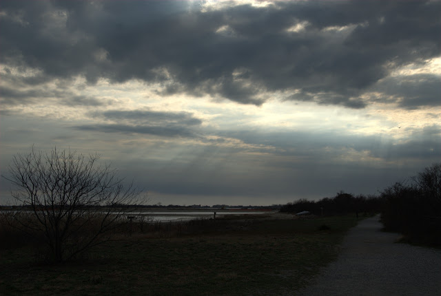
Went out this past Saturday and found myself at Jamaica Bay National Wildlife Refuge at the end of the day. The weather had been threatening rain all afternoon, but I took the chance to go there anyway. Aside from a nesting pair of Osprey, and a flock of Brants feeding at the shoreline, there was the sky. That kind of sky that you see before or after a storm. Bits of blue in the cloudless areas, the warm color of a soon-to-set sun reflecting off the numerous clouds, and a totally clear view of the whole spectacle - but my sights were set on the Osprey couple.

So I snapped off a few pictures without thinking. When I viewed the images on my computer, they looked pretty sad. The sky was correctly exposed, but everything else was drab and dreary. This was not at all how I remembered the scene, so I started thinking about how I might restore the original "feel" in the image.

There are a number of tools that can help you recover an underexposed image - Lucis Art, Topaz Adjust, the built-in tone mapping available in Photoshop - but I decided to use Photomatix Pro - mainly because I like the quality of the output and the relative ease with which I can get those results.

For a full description on how to use Photomatix Pro, look at my blogpost here. The process with a single image is similar to the one you would follow for a multiple image HDR after you merged the images into a single image. Basically you have two main options - Tonemapping and Exposure Fusion. The Tonemapping selection has two choices - Details Enhancer and Tone Compressor. I find the following workflow useful:


  1. After loading the image, select a preset that gets you closest to the "look" you are trying to achieve.
  2. Use "Strength" at close to 100% to  control how contrast will be affected by the subsequent adjustments.
  3. Set white point, black point, saturation and gamma to please your eye.
  4. Start making adjustments using smoothing, micro smoothing, contrast, microcontrast, luminosity etc - until you have gotten closer to your goal. 
  5. If you end up with halos, use highlight smoothing to remove them.
  6. Save and open the image in Photoshop - make whatever cropping, tone, contrast, color balance, sharpening and noise reduction adjustments you typically make. At this point you should be done. 


I have included several before and after examples below.


Wednesday, March 21, 2012

It's All About the Light . . .


I was asked to shoot an event this past weekend at a local restaurant - a sweet 16 party which included 110 guests. My thoughts directly went to what gear I would use and how I would do the lighting.

Available light shooting was out of the question - I was informed that the restaurant's dining room lighting level would be held low. I would have to use a fast zoom lens in any case, because a slower lens would have difficulty acquiring focus in such low light. I decided on an 18-50 F2.8 zoom for my D300, which gave me the flexibility of very wide to moderate telephoto, and would still be sharp at F2.8. But it would still not be fast enough to shoot available light, unless I used an ISO of 6400 or higher. The D300 image begins to look pretty crappy at ISOs higher than 800, so speedlight(s) would be the only logical choice.

Among the choices for lighting were on camera flash, which could be bounced for more even lighting, but I had hoped that I could do something a little different. I don't care for camera-positioned lighting because no matter what portable modifier you use, the quality of the light is flat and unappealing, with no contour-shaping shadows, except for that shadow that ends up under the chin and nose when you use those tall swiveling flash brackets that all the paparazzi use.  Another undesirable characteristic is flash shine - an area of perspiration-moistened or oily shiny skin that reflects more light, usually resulting in unflatteringly overexposed skin areas. With the expectation of shooting 100s of pictures there was no way I would spend days in Photoshop correcting shine.

I decided that the room was small enough to light the room with flash. It was time to mobilize the over half-dozen second-hand speedlights that I have collected over the years. All of them are made by Sunpak - 433D, 444D, 360D, and the venerable and highly sought after Auto 383. Each has a guide number of 120 making them as powerful as the best offered by Nikon or Canon these days. But more important - adjustable light output levels. I figured that with enough lights strategically placed I could illuminate the entire party room and keep the output levels low enough to be able to shoot the entire 4 hour event, take 400 images and not have to change the batteries.

I visited the restaurant the night before the event to check out possible locations for lighting. There were wall-mounted sconces that were large enough to conceal my lights, but they were too far from the ceilings. This distance is important since the light to subject is significantly greater when the light has the longer path to travel from the flash head to the ceiling then to the subjects. Also, there was a greater chance of getting the flash in the shot, which can work for dramatic effect if used judiciously, but definitely not ok for every other shot.This alternative was not going to work for me.


I decided to use super clamps to attach the speedlights and flash triggers to the chandeliers. With a little trial and error I was able to point the lights to cover the room with 7 speedlights, which left me one for the camera for low power fill. The ceiling-bounced flash was set to 1./4 power. This provided relatively short recycle times and low power consumption.

These were triggered with my favorite radio triggers, the Yongnuo RF602.


The quality of the indirect strobe lighting for all intents and purposes resembled available light -with some  wonderful benefits. Speedlights bounced off the ceilings spread light in all directions - softening up the shadows and providing lovely flattering light without any sign of harshness.


They freeze action by virtue of their short but intense burst of light. There would be no risk of motion blur. People were captured sharp and clear. No "tunnel effect" where the subjects are brightly lit and everything else is in dark shadow.


I could use a lower ISO (800) and still shoot at F5.6 - F8, the "sweet spot" for my lens as far as sharpness is concerned. And finally, I could take a long shot of the room and show all the people in it - none of that "tunnel" effect that is so common when camera mounted flash is your only source of light.

Below are two images. The first taken with a flash used with a bounce card mounted on a rotating bracket attached to the camera as the primary (key) light. The second utilizes the chandelier mounted flash bounced off the ceiling with a tiny amount of fill light from a camera-mounted flash using a bounce card. The power level on the camera's flash was either 1/8 or 1/16.


You can see the difference - the girls in the lower image have softer features, you can see highlights in their hair, and the lighting is a bit more interesting.  The upper image has harsh lighting, the hair gets absorbed by the dark background, and there is that deep dark shadow under the chin and in the eye sockets.

This lighting approach cannot be used in all situations - sometimes the room is just too large, or the ceilings are too high. This demands some other form of bounce lighting, perhaps with more powerful monolights with radio or optical triggers, umbrellas or softboxes, etc. But for this application, the little guys were perfect, and everything worked out just fine.

Tuesday, March 13, 2012

Dreaded Lens Flare? Here's How I Deal with It.

Ask any photographer about lens flare - you will probably get an ugly expression accompanied by some choice expletives that I will not print here. It's a law of photography (that probably needs repeal) that you should always keep the sun at your back or side. The reasons are to provide better lighting on your subject, and to avoid - DREADED LENS FLARE - from ruining your shot.

I like to break rules, especially one like this. The many photographs of the setting or rising sun is one example that shows that I am not alone here. Sunlight filtering through the trees will also wreak havoc on images that are made with lenses that are prone to flaring. Lots of times these images are taken just before sunrise or just after sunset to avoid flare. If I like the light and composition I will typically shoot right into the sun if necessary to get what I want, then fix it later. There is a mood, an element of "drama" that results when you shoot into the light in these conditions that is hard to capture if you simply follow the rules. You can fix certain "features" in postprocessing, but you can forget about a bad composition that results from trying to avoid shooting into the light.


Needless to say, there are some obvious challenges here. First is the amount of light coming from the sun. It will fool your meter and make everything go to silhouette if you are not careful. HDR (covered in my earlier post) will take care of extremely wide contrast range and you can work in Photoshop using a combination of tools to tame down the flare.

Flare has two components. A strong color cast and a change in luminance.Where the flare occurs will determine how I go about fixing it.

Flare in an evenly toned sky or detail-less surface is the easiest. Just create a duplicate background layer and use the patch tool to select an adjoining area of sky and move the patch over the area that needs to be fixed. Done!


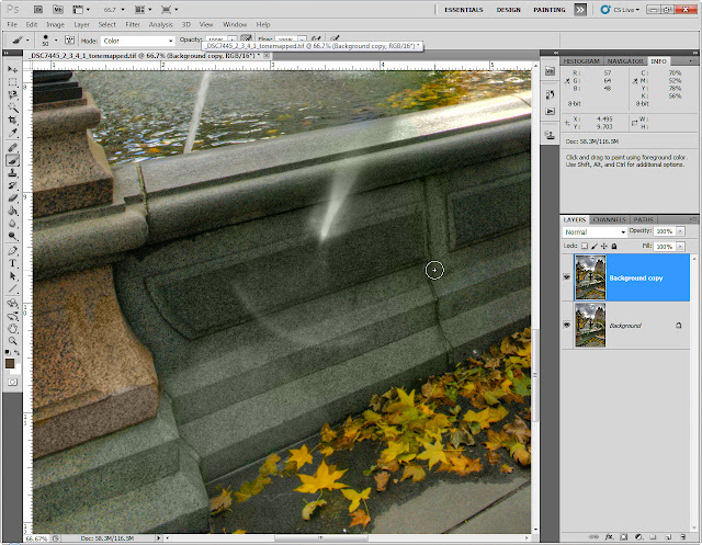
Flare that shows up in detail areas is more difficult. Here I employ a two-step process. First I remove the color cast. I start by creating a duplicate layer and selecting it, then I select a brush from the tool palette,


change the brush's blend mode to color;


then I select the eyedropper tool;


and and its sample size to 11x11 pixels;


I then select the brush tool again, and using the right click to enable the eyedropper, I sample a similarly colored area to use as my brush color.


I then paint over the flared area until all the green, yellow or magenta (or other color) is "neutralized." By using the color blend mode on the brush, the detail and texture is left intact, and I am only replacing colors.


Now you see it,


and now you don't!


At this point I usually flatten the layers once I am satisfied with the color removal. My second step involves adjusting the difference in luminance and/or reconstruction of the brighter area.


I decide what tool to use - content aware fill, clone, patch, or burn-in based on the type of repair I intend to make. If there is detail and the difference in tone is not that bad, I will burn in the area, which is the way I went with on this image.


Photoshop provides a dodge and burn tool, which lets you limit its effective range to shadows, mid-tones or highlights. I usually bypass this and create a new "dodge and burn" layer, fill it with 50% gray, set the blend mode to overlay or soft light, and use a black brush set at 15% opacity and 15% flow. I paint directly on the 50% gray layer. This darkens the area smoothly with minimal effect on color saturation or hue. The reason this works so nicely is that both overlay and soft light are contrast enhancing, but the closer to middle gray the tone is the less the effect. Anything that is middle gray is completely transparent to the layer below it. It is easy to build up density with black or white and be very precise about where you are dodging and burning. If you want to check your progress, turn the gray layer' visibility on and off. If you have to back off on an adjustment, use the opposite color brush - white to fix black mistakes and vice versa. If you don't like at all what you have done, just delete the layer and start over again.

Here is the final image:


Monday, March 12, 2012

What You Saw is NOT What You Got?

Consider the following scenarios. You are careful to set a proper white balance when you take the picture, then you come home, load up Photoshop (or the image editing program of your choice), and you get it looking perfect. Then you pirnt and something goes wrong - it looks like someone switched your files between the moment you press Print and you see the printhead moving back and forth creating an image. The results are just WRONG. Colors are different, the orange shirt is now salmon-colored, people are red-faced, a white dog is orange, the purple flower is now a bright shade of magenta, etc.


The immediate response is to go back to your image editor, or your printer dialogue and based on what you see in the print you start making adjustments - a little less magenta, a little more cyan, add some yellow - wasting tons of ink and paper in the process - and when its over you are wondering if your printer is broken.

Or, there is a different problem. Everything looks great on the screen, that cloudless blue sky is deeply saturated and perfectly smooth from edge to edge. You look at the print and it seems as if someone dropped coffee grounds during the print process. This is sensor dust. But there is a problem - you go back to the screen image and you can't see them. My guess is that you are using either a laptop or an inexpensive LCD/LED display with a limited bit depth. Without getting too technical, unless specifically noted in the specifications, all-purpose displays such as the sub $200 flat panels or those in laptops are not capable of displaying the more subtle gradations in tone and color. Sometimes his will come across as banding on a sky, where you have a very gentle shift in hue, saturation and luminosity from horizon to the top of the frame. Other times minute dust particles may have settled on your camera's sensor and blocking the light getting to the sensor directly beneath the particle, causing a "dust shadow" to appear. But in the bargain monitors, the bit depth is not enough to differentiate the subtle changes, making the dust spots invisible on the display. Most printers have a wider gamut, and are able to print this information,  The better the printer, the better the ablilty to display everything that is in the image - including the dust spots. Here is an example of dust spots:


If you don't see the dust spots, then there is a good chance you have one of "those" monitors. If you are serious about image quality, either sending it to others electronically or making a print - then its probablay a good idea to put a replacement display into the budget.

Well, as far as the first situation is concerned, there's an app for that. More accurately, there is a combination of hardware and software that you can purchase to address the difference between displayed vs printed colors and tones. There are a class of products called monitor/printer profiling applications that will fix the majority of the issues. These consist of a either a colorimeter or spectrophotometer that measures your monitor's native colors and gray tones on a test pattern, then creates a table of values that correct the differences between what the monitor shows and what the neutral standard is, and then builds a monitor profile that loads when you start your computer, making all the necessary adjustments. this way a green on screen will look like the green that will be printed - more or less. It's hard to do any image editing and color correction without at least the display being calibrated.


With the color accuracy of your display now under control, you have to address the print. If you use a printer manufacturer's inks and paper (and printer profiles if provided), or if you use a printing service. you are likely to get decent results - not perfect by any means, but reasonable. Most inexpensive printing services will use a hybrid technique, employing a digital projection onto silver halide emulsion paper, then processed in conventional wet process chemistry.  The more expensive houses will use high quality, color profiled and calibrated inkjet printers. Each paper type offered will have its own profile. the printers will use anywhere from 8 to 12 different pigmented inks - providing the widest color gamut and dynamic range possible. Very few affordable processes can even begin to approach the quality obtained from a properly processed inage printed on a 12 color image printed on rag paper in a color managed workflow.


Spyder Studio with monitor and printer profiling

Luckily the tools used to do this at the pro or commercial level are available in scaled down versions for the consumer. Datacolor and Xrite both offer affordable profiling solutions that work with most displays and printers as well as more expensive ones for professional printers and photographers. These create profiles for either printers or displays, or both.

The dust bunny situation involves being able to see the dust before you print. This requires using a display that is capable of showing dust.  At the present there are only a handful of displays that can do this - those which use e-IPS, S-IPS, P-IPS, H-IPS, AS-IPS, H2-IPS and UH-IPS. IPS stands for In Plane Switching, a display technolgy developed by LG Philips in 1996. LG makes nearly all the IPS panels currently available in the marketplace. For all intents and purposes the S, H and P-IPS panels are the ones to look for. The e-IPS is an adaptation of the technology to lower the cost, and more often than not can only display a color depth of 6 bits per color, or 2^6 x 2^6 x 2^6 = 64 x 64 x 64 = 262,144 colors simultaneously. This is not good for photo editing applications. The way 6 bit panels create 16.2 million colors is by rapidly switching between 2 colors at each pixel, creating the illusion of greater color depth - but while they look good for general applications, not being able to see all the information without switching is going to present problems seeing subtle things like dust and other artifacts. Sometimes you will see a panel specification stated in terms of a percentage of a color space. You might see something like 72% of sRGB. Most printers can now print close to 100% of sRGB, which means that the prints will show more color and tonal variation than your display, whicn in simple terms explains why you won't be able to see the dust bunnies on a $200 LCD/LED panel. With the exception of some Apple products and the Lenovo Thinkpad X220, nearly all displays are 6 bit.

The image below is an exaggeration, but a good way to illustrate the difference between high and low bitrate displays. The dithering is the switching that takes place - this is a static image, but you should be able to still see the banding. The rightmost color is typical of what you will see on an 8 bit (x3 = 24 bit) per color display.


At the very minimum you should be looking for a panel that can display 8 bits, or 2^8 x 2^8 x 2^8 = 256 x 256 x 256 = 16,777,216 simultaneous colors. These typically can display a color space as large as sRGB, considered the minimum for photo editing, and the pricier versions can display up to Adobe RGB, a bigger color space. A rule of thumb is to get the largest color space you can afford., but not less than 98% sRGB. The specs that are meaningless to you are speed, brightness, contrast ratio, etc. These are all well-beyond what you need. In some cases flat panel displays can be too bright, making it difficult to profile.

There are a few very costly 10 bit panels, which if you do the math,  2^10 x 2^10 x 2^10 = 1024 x 1024 x 1024 = 1,073,741,824 simultaneous colors. These are absolutely breathtaking, but be prepared to spend more than $1100 for a 27"panel. The problem with these is that unless you can create a 10 bit workflow, such a display is overkill. Most cameras are 8 bit, as are printers. There are few photo editors that can work in 10 bits. It is easy to see that  having a 10 bit panel would be unecessary.

You can find a list of popular IPS displays with street prices here . The ASUS PA238Q seems to be the least expensive 8 bit panel that offers full sRGB display at $300. I suggest that you look for reviews or a list of specifications for any display you are interested it to ensure that it is suitable for your purposes.


Once you are able to see stuff like dust spots, you need to be able to remove them, and there are two methods to accomplish this. Each has its good and bad points. The more conservatie but costlier approach is to send you camera in for a sensor cleaning. Give to someone else to do and if something gets messed up in the process, they will (hopefully) take care of things. This can cost from $50-$100 and you can be without your camera for several weeks.


dry and wet sensor cleanng system
You can always purchase a blower, dust brush and wet-cleaning swabs and solutions for around the lower price of sending the camera out. A blower and a brush,should be standard equipment, since the majority of sensor dust is removeable with these gentler tools. Use the mirror lock up function to expose the sensor, and using a light to see what you are doing, use a blower that is intended for this to gently blow the specs away. Sometimes you need to use a little "gentle persuasion" to get the more stubborn specs off. Under no circumstances should you use the compressed air products, which use unfiltered air, and can blast microgrit across your sensor, permanently etching it in the process. Actually, you would not etch the sensor itself, but the low-pass filter that is in front of it. In any case, you would be looking at a costly repair, typically in excess of $200.


If you are daring enough, you might try the wet method. This includes a swab of lint free material attached to a paddle that you dampen with a cleaning solution and wipe once across the sensor. Any time you touch the sensor you run the risk of scratching the filter, so you need to be super extra careful and resign yourself to the $200 or higher repair should things go wrong. I have done it 3x on my D200 with no damage, but everyone's mileage is different. If you at all nervous about this, just send it in.